
Utilities App UI/UX Case Study
January-February 2021
Figma, Illustrator, Photoshop
I was the sole designer and researcher on this project. I conducted user interviews, and created personas, style guides, wireframes, and more.


Initially I started by conducting short interviews, and asking users to fill out a questionnaire. This allowed me to glimpse into their typical day to day usage of the Louisville Water Company services and revealed pain points for the user.
•Time spent is less than 10 minutes per month on the LWC website. Most people only use the service to pay their bill online.
•Users thought the site was overly complicated, redundant and dated looking. Site did not look or seem cohesive.
•The auto-pay feature was a very popular feature with nearly all users.
•Paying your bill was a giant source of frustration, this part of the service is not optimized for online use and is confusing.
•Customer service is basically non-existent online, you have to take time and call into a hotline and wait on the phone to get help with anything. Online customer support was a popular request.
•Payment confirmation is confusing and users sometimes do not know if their payment went through or not.


After conducting the user questionnaires I set out to determine the app structure and to figure out the most effective and least complicated architecture possible.
I wanted to focus on the main few features that every user will use regardless of their background; the ‘sign up’, ‘log in’, and ‘pay bill’ pages. After the main features, everything else needed to be consolidated and easy to find and intuitive.
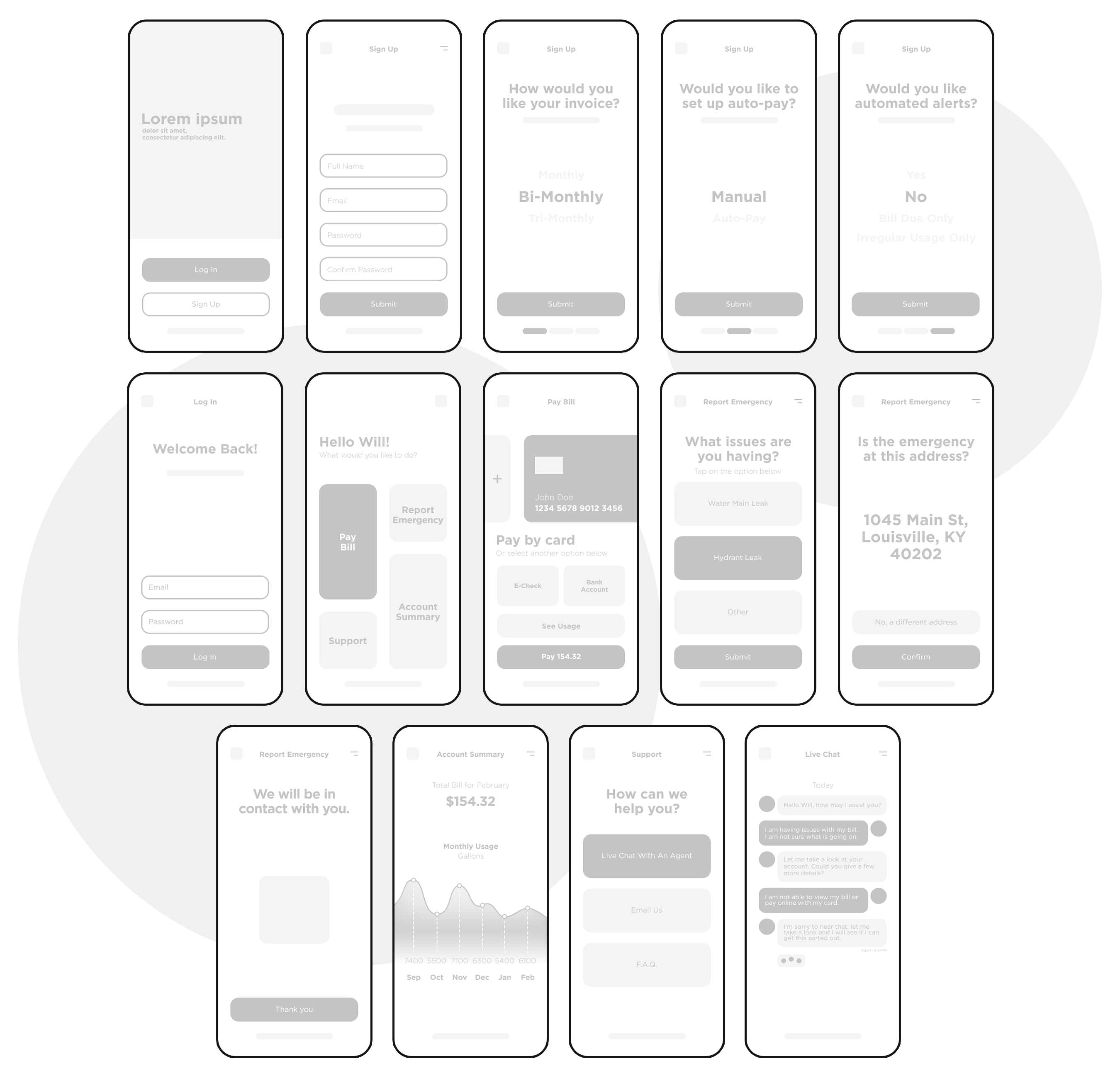
Once i had a general structure, I moved on to creating wireframes. I kept this very minimalistic and barebones so that I could change things in the future before the final screens if needed.

Gotham is a geometric sans-serif typeface family with letterforms that were inspired by examples of architectural signs of the mid-twentieth century. It’s familiar look is easy to read for all demographics.
Finally we come to the prototype screens. I used the style guide to add the final touches to everything as well as place images and icons where needed.
.png)